|
|
Post by -The Answer- on Oct 12, 2006 17:57:02 GMT -5
|
|
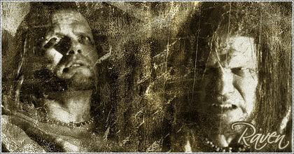
Original XD Deadman
Mega Mod  "Tragedy is when i cut my finger. Comedy is when you fall into an open sewer and die." - Mel Brooks.
Posts: 2,857
|
Post by Original XD Deadman on Oct 13, 2006 2:04:29 GMT -5
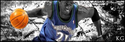
I'm liking it 8.3/10
I really like how the ball stands out from this image and the rest of the image blends to its BG. Nice!
|
|
|
|
Post by Wildcard on Oct 13, 2006 9:18:12 GMT -5
three things stand out; the ball, the clothes, the white diagonal lines in the background. i would lose the lines in the background and blend the ball/jersey in with the background colours/KG's Skin, 5/10
|
|
|
|
Post by -The Answer- on Oct 13, 2006 23:01:22 GMT -5
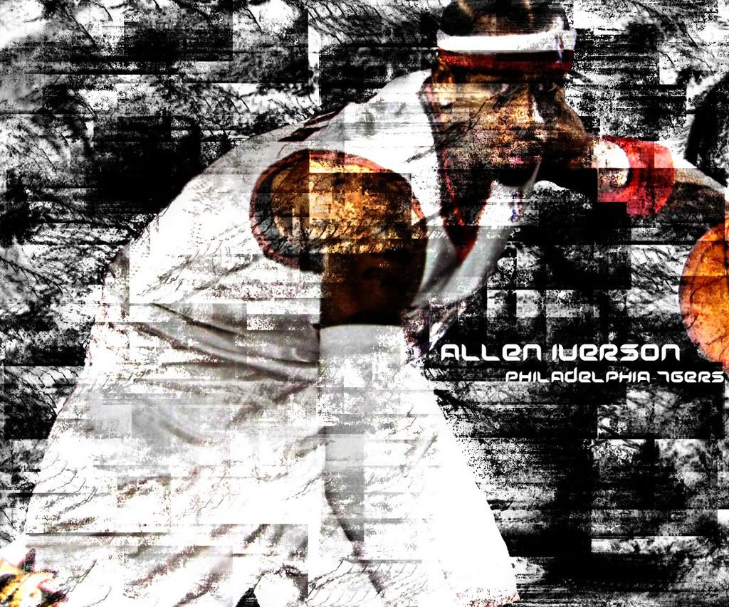
The point of the GFX was for the jersey and ball to stand out. I was trying to put a Sin City theme to it.
|
|
Original XD Deadman
Mega Mod
"Tragedy is when i cut my finger. Comedy is when you fall into an open sewer and die." - Mel Brooks.
Posts: 2,857
|
Post by Original XD Deadman on Oct 14, 2006 23:06:57 GMT -5
I totally understand their Answer i still think you've come along way.
|
|
|
|
Post by -The Answer- on Oct 15, 2006 1:47:51 GMT -5
I know, I was explaining it to David, cause he said I should have blended everything, but it's not the point of the sig.
|
|
|
|
Post by Wildcard on Oct 15, 2006 7:15:29 GMT -5
"i would lose the lines in the background and blend the ball/jersey in with the background colours/KG's Skin" I was just saying what i would have done, everyones got their own view.
|
|
.TRUTH
Moderator  *Truth GFX*
Posts: 1,467
|
Post by .TRUTH on Oct 15, 2006 20:48:44 GMT -5
pretty soon im gonna be gettin classed in my gfx skill and a VERY good graphics site, they class u from novice, moderate, intermediate, semi-pro, and pro. then u battle others in ur class, so yeah Im steppin up and takkin my gfx to the next level  i dont really need advice or anything, just felt like sharin it with u guys, maybe give u some inspiration or somethin  |
|
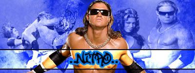
.:Nitro:.
Administrator  Raw is Nitro
Posts: 3,557
|
Post by .:Nitro:. on Oct 18, 2006 2:13:59 GMT -5
ok den tell me wat you think of this O'Mac's latest GFX  |
|
mdogg
Mega Mod
marVel
Posts: 2,324
|
Post by mdogg on Oct 21, 2006 0:01:29 GMT -5
Truth: I'd be interested in learing the ways..lol.. Steve: Not too bad, the pic on the right is what really takes it down for me. Took me a second to understand the text, maybe a small border around it with a similar color. 6/10 Got some new ones...First a buddy of mine made this one:  Then these are mine:  Then we have the same banner but different colors and background:   Then, I changed up the back pic a little and changed the front a little, and a different back.  And finally, the Shelley Siblings  |
|
.:Nitro:.
Administrator
Raw is Nitro
Posts: 3,557
|
Post by .:Nitro:. on Oct 29, 2006 21:46:52 GMT -5
the more sigs i see of yours dogg the better they get the cuts are superb the bg is very good the font is pretty nice aswell and the colours are so easy to the eye i just enjoy looking at them heres a sig i did for someone on another forum 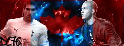 and my latest one see sig |
|
.:Nitro:.
Administrator
Raw is Nitro
Posts: 3,557
|
Post by .:Nitro:. on Nov 8, 2006 20:26:17 GMT -5
and a new one see sig.
personally this is my fav out of all the ones i've done
|
|
.:Nitro:.
Administrator
Raw is Nitro
Posts: 3,557
|
Post by .:Nitro:. on Nov 10, 2006 21:54:03 GMT -5
2 more here this time wrestling themed 1st one a sig  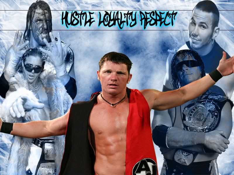 |
|
.:Nitro:.
Administrator
Raw is Nitro
Posts: 3,557
|
Post by .:Nitro:. on Jan 7, 2007 6:54:49 GMT -5
my johnny nitro sig and my mnm sig plus a new avy r8 plz this time
|
|
|
|
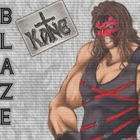
Post by Blaze on Apr 25, 2007 14:50:42 GMT -5
Well this was a long time ago but i rate anyway i do like these Nitro especially your Sig and avatar i give them 8 out of 10 and i also like the big one with Aj and everyone else but i will say one thing about it i think that the stroke around the writing could be a darker blue that way it would stand out alot more buit overall it gets about 7.5/10 and the Paul Robinson one is great i especially like the White Heart Lane Stadium in the background i give this an 8.5/10 OVERALL GREAT WORK MATE heres something i designed for myself on a football forum i no you may think the team is s**t but just rate the work not the team lol  |
|